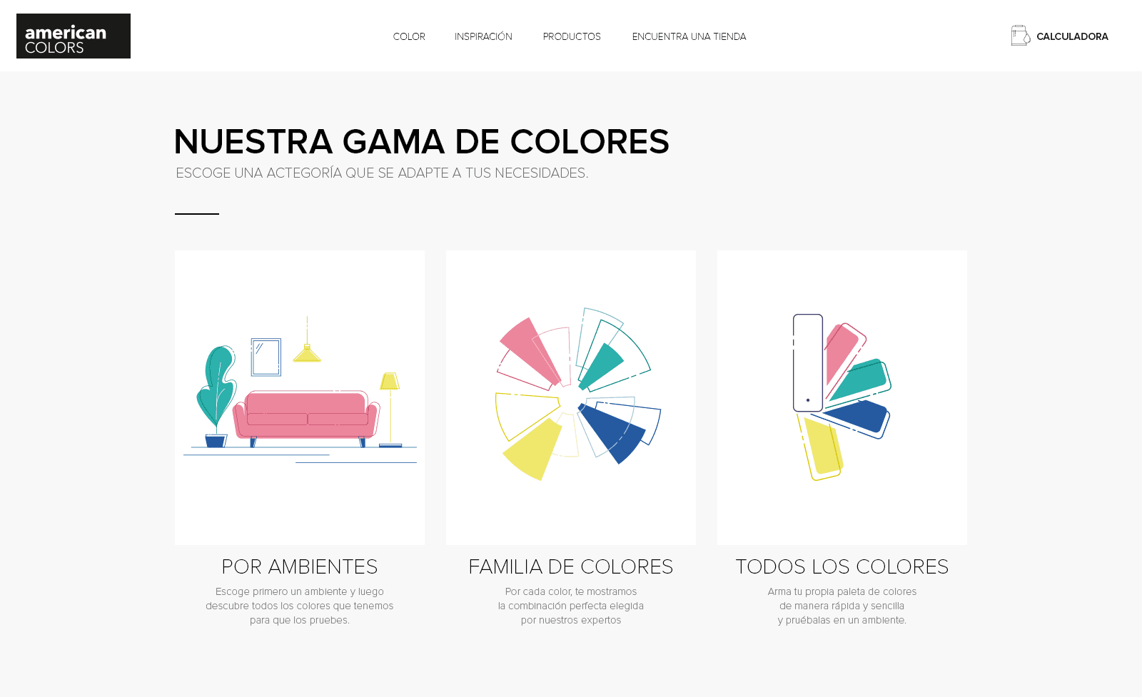
American Colors: Redesigning a vision beyond paint

American Colors: Redesigning a vision beyond paint

American Colors: Redesigning a vision beyond paint

UX/UI Design

Client:

American Colors

Year:

2019

UX/UI Design

Client:

American Colors

Year:

2019

UX/UI Design

Client:

American Colors

Year:

2019

Project Overview

The Challenge

AMERICAN COLORS is Peru’s premium brand for exterior and interior paint, known for its philosophy: “You don’t paint, you decorate.” This vision emphasizes that painting isn’t just functional—it’s essential to the architectural and aesthetic beauty of a home.

The website redesign aimed to reflect this idea. Instead of presenting AMERICAN COLORS as a typical paint company, I crafted an interior design-inspired digital experience. The site included trend-based inspirations, practical tips, and a color exploration tool to help users choose perfect color combinations.

Project Overview

AMERICAN COLORS is Peru’s premium brand for exterior and interior paint, known for its philosophy: “You don’t paint, you decorate.” This vision emphasizes that painting isn’t just functional—it’s essential to the architectural and aesthetic beauty of a home.

The website redesign aimed to reflect this idea. Instead of presenting AMERICAN COLORS as a typical paint company, I crafted an interior design-inspired digital experience. The site included trend-based inspirations, practical tips, and a color exploration tool to help users choose perfect color combinations.

The Challenge

I joined this project midway after the previous designer left, stepping into my first-ever web design role. Until then, I was primarily an advertising designer. Many key functionalities were incomplete, and I was unfamiliar with UX principles.

Despite the steep learning curve, I relied on my problem-solving skills to create an intuitive, visually engaging interface. This project became my crash course in UX/UI design—and a testament to adaptability and creativity.

Homepage

Homepage

Paint Calculator

Paint Calculator

One common challenge customers face when tackling wall painting is determining how much paint they need. To address this, we integrated a paint calculator into the website. While it provides an estimate rather than a precise figure, the tool offers customers a clearer understanding and helps them plan more effectively.

One common challenge customers face when tackling wall painting is determining how much paint they need. To address this, we integrated a paint calculator into the website. While it provides an estimate rather than a precise figure, the tool offers customers a clearer understanding and helps them plan more effectively.

Find a Store

Find a Store

American Colors goes beyond selling paint by helping customers choose the perfect color for their walls, tailored to their environment and personal tastes. To provide this level of service, Qroma, AC's parent company, offers specialized stores called ‘Color Centers’ where customers can find both the product and expert advice. To make this accessible, we included a store locator on the website, allowing users to easily find the nearest location in their preferred district.

American Colors goes beyond selling paint by helping customers choose the perfect color for their walls, tailored to their environment and personal tastes. To provide this level of service, Qroma, AC's parent company, offers specialized stores called ‘Color Centers’ where customers can find both the product and expert advice. To make this accessible, we included a store locator on the website, allowing users to easily find the nearest location in their preferred district.

Color Gamma

Color Gamma

Research conducted before my involvement in the project revealed a key insight: customers are more likely to choose a color when they can visualize how it looks on a wall. This insight shaped the development of the website’s core feature: the Color Palette Simulator.

This tool allows users to explore AMERICAN COLORS' extensive range of unique hues and see how they would appear in real-world settings. Users can test colors on pre-selected photos of various environments and save their selections as a PDF document. This PDF then can be printed and taken to the nearest Color Center for further guidance.

The simulator is divided into three sections, with “Por ambiente” and “Todos los colores” offering similar functionality but differing in the initial selection steps. This structured approach ensures an intuitive and engaging experience for users.

Familia de colores

In this section, users can select a triad of colors curated by a professional interior designer. Each color family offers three expertly suggested triads, making it easier for users to create harmonious and visually appealing combinations for their spaces.

Testing the triad

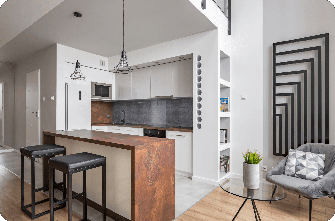
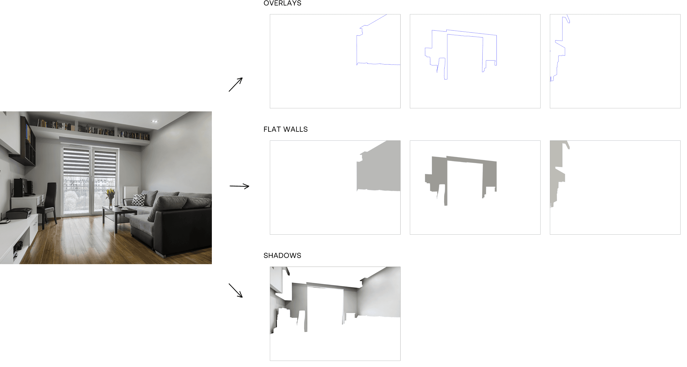
After selecting their triad of colors, users could test it in a pre-selected environment, with a maximun of three paintable walls.


Here’s the twist: when I joined the project, this feature was just an idea — no structure, no flow. The concept was clear: users would see a room and paint the walls with their triad. But how to make it happen?


I was unfamiliar with UX design at the time. My background was in graphic design, but I used my problem-solving mindset to jump in and figure it out. I asked key questions that any UX designer would:


How do I choose the paint color?

How do I paint the wall?

How do I know which color is selected?

What if I want to change the triad but keep the environment?

What if I want to switch environments but keep the triad?

How do I reset the walls if I don’t like my design?

How do I move on to the next step?


I worked through each of these, collaborating with developers and refining the design. Even though I was new to UX, I relied on my strong design instincts and problem-solving skills. This resulted in an interactive feature that allowed users to easily test their color choices, change triads or environments, and reset the walls as needed.

We achieved the paintable walls by separating the photo into PNG layers: each wall as a flat color with their corresponding overlay and the shadows. This allowed us to change the wall colors dynamically while preserving the room's overall look.

We achieved the paintable walls by separating the photo into PNG layers: each wall as a flat color with their corresponding overlay and the shadows. This allowed us to change the wall colors dynamically while preserving the room's overall look.

We achieved the paintable walls by separating the photo into PNG layers: each wall as a flat color with their corresponding overlay and the shadows. This allowed us to change the wall colors dynamically while preserving the room's overall look.

We achieved the paintable walls by separating the photo into PNG layers: each wall as a flat color with their corresponding overlay and the shadows. This allowed us to change the wall colors dynamically while preserving the room's overall look.

Familia de colores

In this section, users can create their own custom color palette—up to 6 colors—by choosing from the full range the company offers, including factory-made colors and those created through mixing. This feature was designed for more advanced users who enjoy experimenting and curating their own combinations.

Just like the previous section, this had to be built from the ground up. While I followed a similar process, new questions emerged:

• How do I remove a color I no longer want or selected by mistake?
• What if I want to start over and choose everything from scratch?

Solving these challenges led to a smooth and intuitive interface, giving users the freedom to experiment while maintaining control over their choices.

Testing the triad

Since the triad simulation was already in place, testing the custom palette was much easier. With fewer colors to manage, the process was more straightforward, allowing for quick adjustments and a seamless experience for users to test their newly created palettes.

All 3 sections share this 2 steps:

Choosing an ambient

Saving Palette

Product Page

Product Page

Takeaways

This project was a game-changer for me. Even without being a UX designer at the time, I tackled every challenge with a user-first mindset and a knack for problem-solving. From creating paintable walls to building a flexible palette tool, I designed intuitive solutions that made complex tasks simple and enjoyable.

What made this special was my ability to adapt and figure things out as I went. With no blueprint, I asked the right questions, collaborated closely with developers, and kept iterating until it worked as intended. It wasn’t always easy, but each challenge turned into an opportunity to create something meaningful.

This experience proved that titles don’t define skills. Curiosity, empathy, and creativity do. It laid the groundwork for my transition into UX/UI design and showed my capacity to solve problems while keeping users at the center.

Thanks for looking

at my project!

Want to dive into the details? Drop me a message!

I'm happy to talk more about it!

Thanks for looking

at my project!

Want to dive into the details? Drop me a message!

I'm happy to talk more about it!

Thanks for looking

at my project!

Want to dive into the details? Drop me a message!

I'm happy to talk more about it!

  • Let’s make ideas happen!

  • Let’s make ideas happen!

  • Let’s make ideas happen! •

WHATSAPP:

662 423 353

WHATSAPP:

662 423 353

WHATSAPP:

662 423 353

EMAIL:

joz.pinto@outlook.com

EMAIL:

joz.pinto@outlook.com

EMAIL:

joz.pinto@outlook.com